
PROJECT B
 EASE PROFESSIONAL MASSAGE
The Homepage


Hero Section
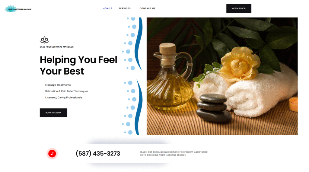
The hero section of Ease Professional Massage features a clean, modern design that immediately communicates professionalism and relaxation. A bold headline, “Helping You Feel Your Best,” is supported by key service highlights like massage treatments and pain relief techniques, paired with a calming lotus icon for a wellness-focused vibe. On the right, a warm, spa-inspired image with towels, massage stones, and oils enhances the sense of tranquility, while the navigation menu and “Book a Session” button provide easy access to important pages and encourage user interaction.
Call to Action Section
Beneath the hero, a dedicated call-to-action section draws attention with a large, bold phone number and a red call icon, inviting visitors to reach out directly. A subtle background shadow adds focus and dimension, while a short message assures prompt assistance and encourages users to book a massage session. This section emphasizes accessibility and builds trust by making communication effortless and immediate.

Why Choose Ease Professional Massage
This introductory section serves as the cornerstone of trust, outlining the core values that define Ease Professional Massage. With a bold headline, "Your Wellness is Our Passion," it immediately communicates the business’s mission to promote health and relaxation through personalized care. The layout is clean and modern, highlighting four key service attributes — Customized Massage Therapy, Tranquil Environment, Experienced Professionals, and Convenient Scheduling — using intuitive icons and concise copy. This thoughtful arrangement reassures visitors that their well-being is a priority, setting a strong first impression.
From a design perspective, the use of whitespace and visual hierarchy makes the content easy to scan while reinforcing credibility. Typography choices support a soothing yet professional tone, with clear callouts that communicate service benefits without overwhelming the user. This section builds emotional connection while directing attention toward action — whether it's booking a session or calling the hotline prominently displayed at the top.
SERVICES OFFERED
Services Offered
The services section acts as a curated menu of massage therapy options, presented in a card-based layout that is both accessible and aesthetically pleasing. With offerings such as Foot Thai Reflex, Swedish Massage, Therapeutic Deep Tissue, and more, each service is briefly described with emphasis on the benefits — from muscle tension relief to prenatal comfort. The light and natural background texture enhances the spa-like feel, while subtle color indicators add a calming visual cue that pairs well with the theme of wellness.
Strategically, this section allows visitors to explore the diversity of treatments without feeling overwhelmed. The grid format encourages comparison at a glance, making it easy to identify which therapy best fits the user’s needs. This not only improves usability but reinforces the brand’s commitment to tailored, professional care. Overall, it’s a perfect blend of form and function — informative without sacrificing elegance.

TESTIMONIALS & LOCATION
Testimonials & Location
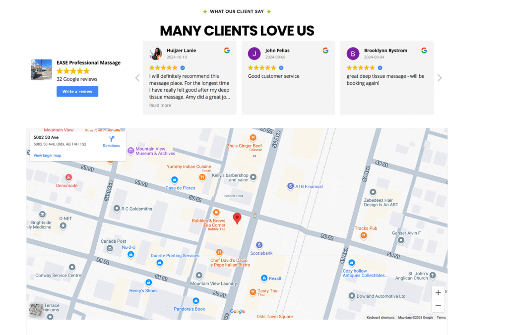
This section focuses on building trust through social proof and physical presence. Client reviews are showcased in a slider format, allowing users to read real feedback from satisfied customers. With names, dates, and profile photos, the testimonials feel authentic and personalized, highlighting positive experiences with specific therapists and treatments. This reinforces credibility while making new clients feel confident about booking their first session.
Below the testimonials, a fully integrated Google Map pinpoints the location of Ease Professional Massage in Olds, Alberta. This not only provides clear directions but also reinforces the business's legitimacy and accessibility. The seamless integration of user reviews and location info supports both digital and in-person engagement, making it incredibly easy for potential clients to transition from interest to action.
CALL-TO-ACTION
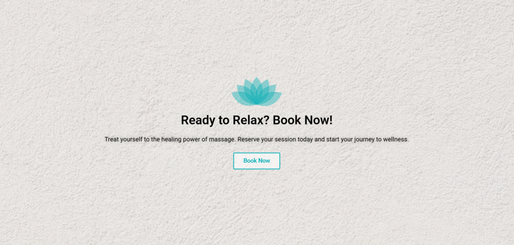
Call-to-Action Section: “Ready to Relax? Book Now!”
This section acts as a compelling, strategically placed call-to-action that guides visitors from browsing to booking. With the headline “Ready to Relax? Book Now!”, the message is immediate and engaging, appealing directly to the user’s desire for relief and rejuvenation. The supporting copy — “Treat yourself to the healing power of massage. Reserve your session today and start your journey to wellness.” — reinforces the value of self-care and subtly creates a sense of urgency, encouraging users to take the next step without hesitation.
Visually, the section stands out with balanced spacing, soft calming tones, and a bold Book Now button that’s easy to locate and click. This button is not just a functional element — it’s a gateway to transformation, placed where interest is at its peak. Whether viewed on mobile or desktop, the layout remains intuitive and conversion-focused, driving bookings while keeping the serene, wellness-driven vibe of the brand intact.
The Footer
The Footer
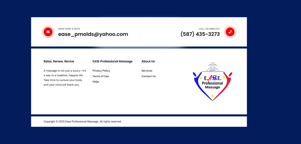
This top-level footer section keeps user engagement seamless by prominently displaying the two most essential contact methods — phone and email — in side-by-side containers. The design is minimal yet functional, ensuring accessibility across all devices. A clear, bold phone number encourages quick calls, while the adjacent email container offers a more flexible point of communication. This layout caters to both spontaneous inquiries and detailed service requests, meeting clients wherever they are in their journey.
Stylistically, the section uses generous padding and a clean typeface to reinforce the sense of calm and professionalism that aligns with the brand’s identity. By separating phone and email into distinct containers, users are never left hunting for contact info, enhancing user experience while reinforcing trust and approachability.
The second section of the footer blends inspiration with information. The first container features a thoughtful quote: “Relax. Renew. Revive...” — setting a serene, wellness-focused tone that leaves a lasting impression. It reinforces the idea that massage is a vital component of self-care, not just a treat, and encourages visitors to prioritize their mental and physical well-being.
The following three containers deliver concise, well-organized navigation. The second container lists essentials like Privacy Policy, Terms of Use, and FAQs, ensuring the site meets usability and compliance standards. The third container continues with quick links to key internal pages — About Us, Services, and Contact Us — boosting usability and SEO. The final container houses the logo, subtly anchoring brand identity at the end of the user journey. This mix of motivation and utility wraps up the site experience with clarity, trust, and visual harmony.
RESPONSIVENESS
Responsive Design Strategy
Ease Professional Massage’s website is thoughtfully designed to ensure a seamless and optimized experience across all devices. For desktop and widescreen users, the layout takes full advantage of screen real estate with spacious padding, balanced grid structures, and elegant typography. Content is displayed side-by-side in multiple columns where appropriate, creating a luxurious sense of openness that mirrors the relaxation and clarity the brand promotes. High-resolution visuals and animations are used subtly to enhance the user experience without overwhelming the design.
As screen sizes decrease, the layout gracefully adapts. On tablet devices (up to 1024px), components stack vertically in a clean, scroll-friendly format, maintaining readability and touch-friendly functionality. For phones (up to 767px), mobile-first thinking is applied — navigation simplifies into a hamburger menu, buttons expand for easy tapping, and all content is center-aligned for maximum legibility. Each breakpoint ensures that no content feels crammed or compromised, delivering a consistent, high-end experience no matter how visitors access the site.

