PROJECT A
 GACHACART
UX & Marketing


UX Design
The website is fully responsive, providing a seamless browsing experience across mobile, tablet, and desktop devices. Its layout and structure prioritize clarity and user-friendliness, allowing visitors to navigate easily and find what they need without hassle. Design elements were chosen not only for aesthetics but also for functionality, striking a balance that encourages longer visits and repeat engagement.
A dedicated blog section is also included to keep customers informed about the latest updates, promotions, and upcoming costume releases. This ongoing content helps maintain a connection with the audience and builds trust through regular communication. Every aspect of the site was thoughtfully designed to reflect the brand’s personality and enhance the overall customer experience.
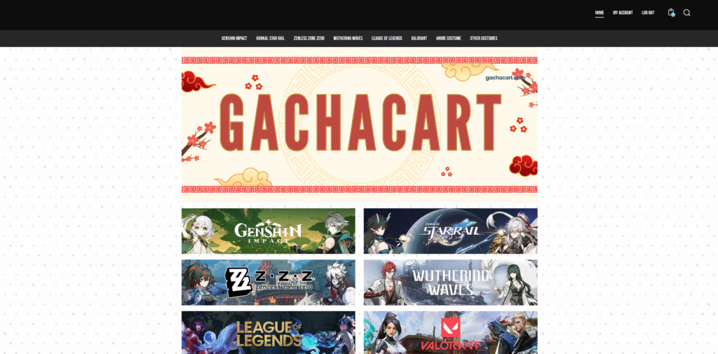
Desktop & Large Full Screen
The desktop version provides the most complete and spacious experience. With a full-width layout, the design takes advantage of large screen real estate to showcase detailed product images, organized sections, and interactive elements like hover effects and custom menus. All navigational components are visible and accessible, allowing users to explore different series or game categories with ease. Blog posts, announcements, and cosplayer features are clearly laid out, encouraging deeper engagement.
This layout is tailored for users who prefer browsing on laptops or monitors, offering a visually rich and functional interface. The design focuses on balance—combining strong visuals with smooth navigation to reflect the brand’s identity while maintaining usability. It also ensures that customers can access all features without unnecessary clicks, providing a comfortable browsing experience from homepage to checkout.
Tablet (Up to 1024px)
For tablet users, the website adjusts its layout to maintain visual clarity and user interaction without overwhelming smaller screens. Content is reorganized to fit mid-sized displays, with font sizes and padding recalibrated for readability and tap accuracy. Navigation elements like menus and buttons remain accessible, often turning into collapsible sections to preserve space while retaining structure. This ensures users can still enjoy the full experience, whether browsing product categories or checking announcements.
The tablet view provides a responsive middle ground between desktop and mobile. It’s optimized for landscape and portrait modes, enabling flexible browsing for users on the go. Features like the custom product menus and blog posts remain intact, providing a consistent and user-friendly interface across devices. The layout supports both casual scrolling and more intentional browsing, adapting smoothly to touch interactions.
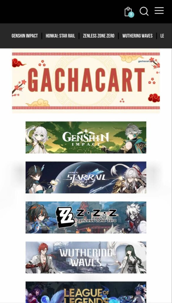
Phone (Up to 767px)
The mobile version is built for speed, simplicity, and functionality. All design elements stack vertically for better readability, and key sections such as product listings, category buttons, and announcements are prominently displayed with touch-friendly spacing. Menus are replaced with hamburger icons or expandable panels to minimize clutter and reduce screen load. Customers can quickly browse by series or game, check blog updates, and view featured cosplayer photos—all with minimal effort.
To ensure a smooth on-the-go experience, performance and ease of navigation are prioritized. Despite the limited space, all essential features remain accessible, and the design directs users toward key actions like messaging the store or placing a pre-order. The layout supports the store’s customer base, most of whom browse using mobile devices, ensuring that every interaction—from discovery to checkout—is seamless and intuitive.
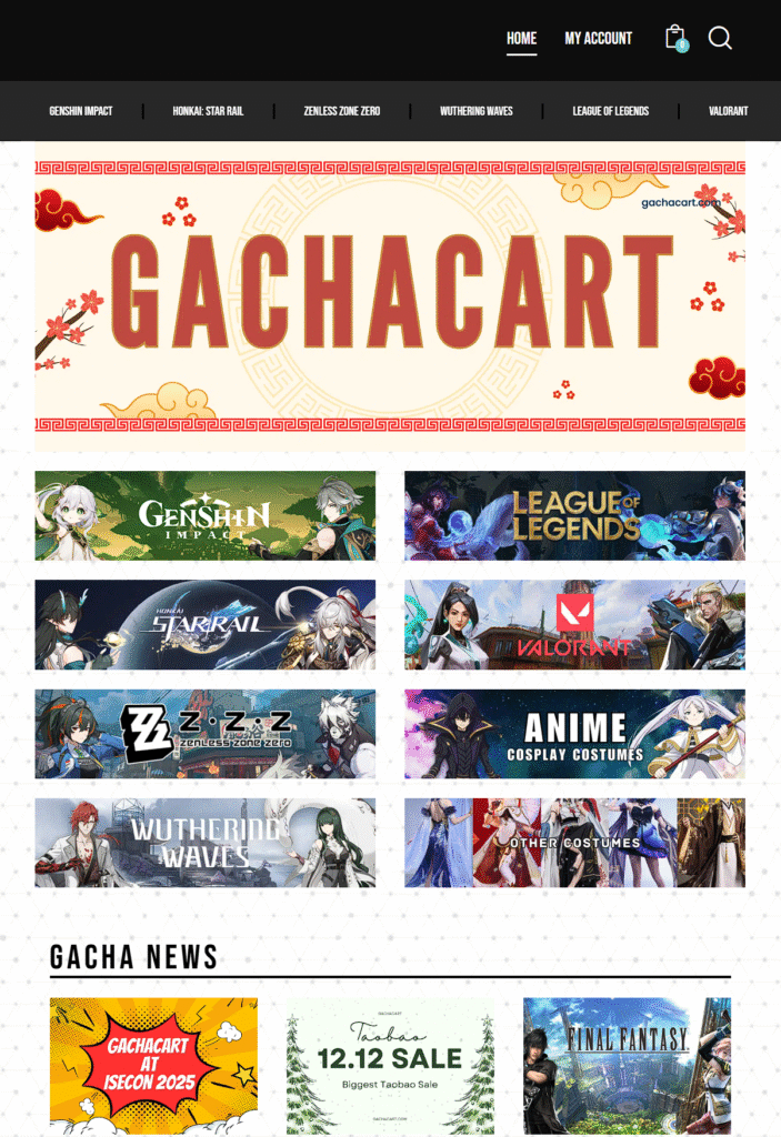
BLOG POST
The Archieves
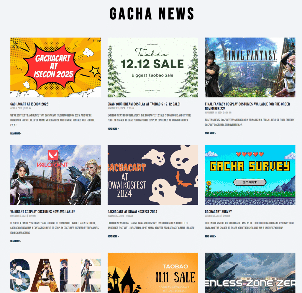
This section of the site presents a structured and visually consistent news grid layout, designed to showcase multiple announcements in a compact, user-friendly format. The page uses a three-column grid system, allowing for a clean arrangement of content tiles that adapt well across screen sizes. Each tile contains a featured image, a bold title, metadata (date and time), a brief excerpt, and a clear “Read More” link—providing quick access to full articles. This modular design makes it easy to maintain and scale, whether adding new posts or rearranging content.
Visually, the layout relies on strong visual hierarchy and alignment. Titles are styled in uppercase bold to create consistency and draw attention, while metadata is placed subtly to avoid visual clutter. The grid ensures equal spacing between elements, and image thumbnails are uniformly sized for a polished, cohesive appearance. This structure prioritizes content scannability, making it easy for users to browse updates, promotions, and event announcements without feeling overwhelmed. The overall design supports a strong UX by combining aesthetic consistency with functional clarity, ideal for a content-heavy section of a fandom or ecommerce platform.
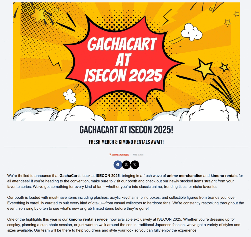
The Blog Post
This webpage follows a clean and modular structure that balances visual impact with readability. It begins with a bold hero section that spans the full width of the page, featuring a high-impact graphic banner that instantly captures attention. This top section acts as a visual anchor and sets the tone for the rest of the page. The header image is followed by a prominent title and subtitle, both center-aligned for symmetry and visual hierarchy. Typography choices here are bold and well-sized to guide the viewer’s focus from the image to the key message.
The body of the page is laid out in a single-column format, maintaining a simple and easy-to-follow reading flow. Key structural elements include a post metadata line (with category and date), social sharing icons placed in a compact inline format, and paragraph content divided into logical sections. Text blocks use varied font weights to emphasize important points without disrupting the rhythm of the design. There is a clear visual break between sections using spacing and horizontal rules, which helps distinguish metadata, body content, and featured highlights. Overall, the structure is intentionally minimalistic to prioritize content clarity while allowing the hero visuals to carry the brand energy of the announcement.