PROJECT C
 KIRIN WEB STUDIO
The Homepage


STRONG CALL-TO-ACTION
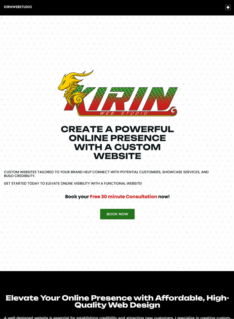
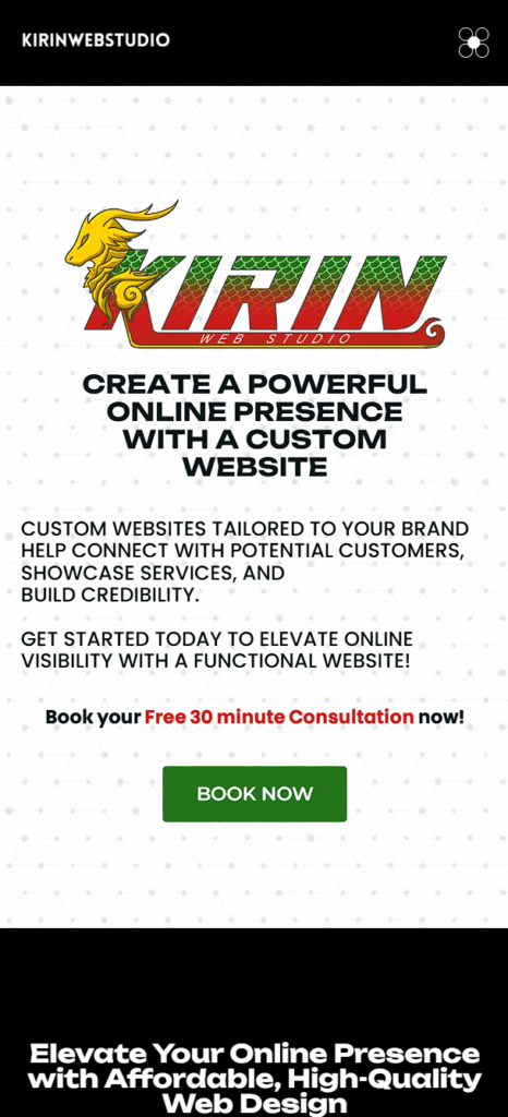
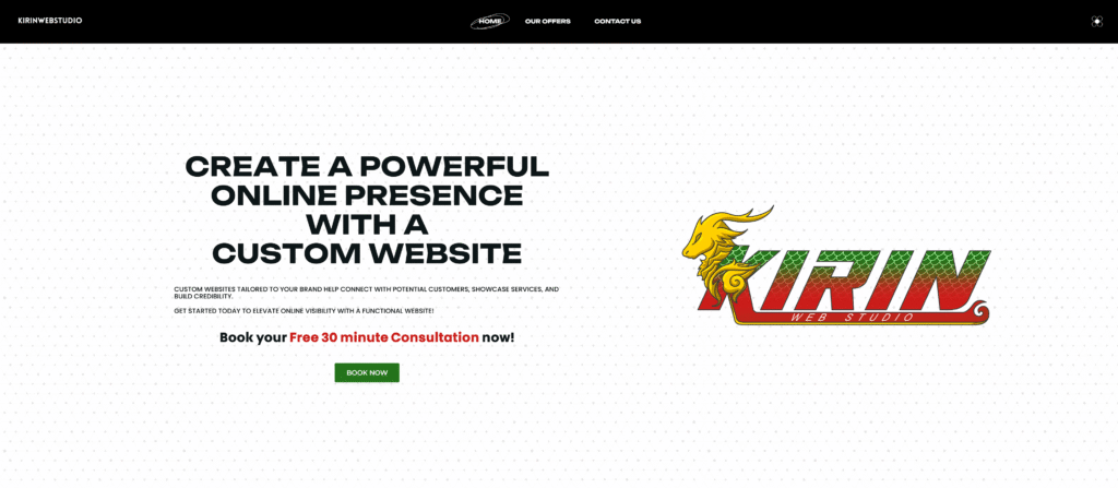
The first section of the hero banner delivers a compelling message designed to attract and convert. With the headline “Create a Powerful Online Presence with a Custom Website,” it communicates immediate value to visitors. Supporting text highlights the benefits of tailored web design—credibility, lead generation, and service visibility—while a strong call-to-action invites users to book a free 30-minute consultation. The “Book Now” button is prominently placed to drive engagement and initiate user interaction early in the experience.
VISUAL IDENTITY
The second section features the website’s logo, strategically placed to reinforce brand recognition and professionalism from the moment users land on the page. It acts as a visual anchor that ties the hero design together, giving the layout a polished and cohesive look. The logo remains prominent across devices, scaling responsively on mobile without losing its impact, ensuring consistent branding at every screen size.
section I
Section 1
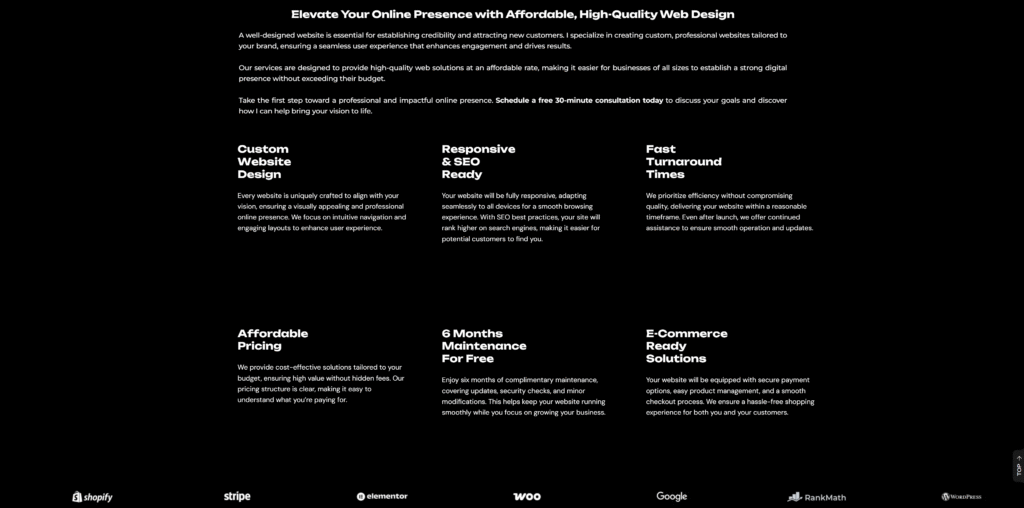
This section showcases a bold and confident introduction, emphasizing the importance of having a strong digital presence through high-quality, affordable web design. It clearly communicates the value proposition—custom solutions, SEO-friendly design, and fast turnaround times—backed by a client-focused approach. The layout is clean and well-organized, using a strong headline, supporting paragraphs, and structured benefit blocks to convey key information effectively.
ELEVATE YOUR ONLINE PRESENCE
Responsiveness and accessibility are prioritized, with each feature visually distinct in a modular grid. Whether viewed on desktop or mobile, the content adjusts seamlessly, maintaining readability and flow. This ensures an optimal user experience across all devices, which is crucial for engaging potential clients and guiding them toward taking action—like scheduling a consultation.
SECTION II
section II
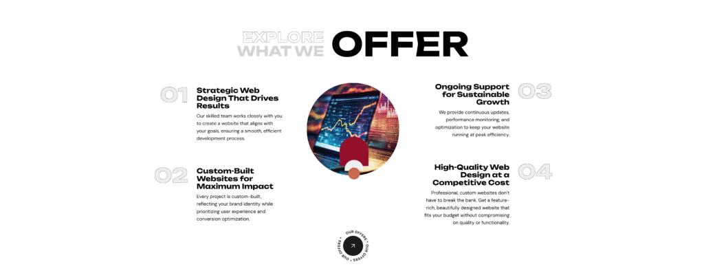
This section highlights the core services with a creative split layout. The central visual element—a dynamic graphic in the middle—draws attention while the surrounding text clearly explains each offering. Strategic use of typography and numbered items adds structure and hierarchy, making the content digestible and visually appealing. The section speaks to the value of strategic web design, tailored builds, ongoing support, and affordability.
explore what we offer
The circular composition reinforces balance and flow, while the minimalist white background keeps focus on the content. Each quadrant is spaced to avoid clutter, adapting beautifully across screen sizes. On tablets and phones, the layout gracefully stacks to preserve usability, ensuring that even on smaller screens, the professionalism and clarity of the offering remain intact.
SECTION III
SECTION III
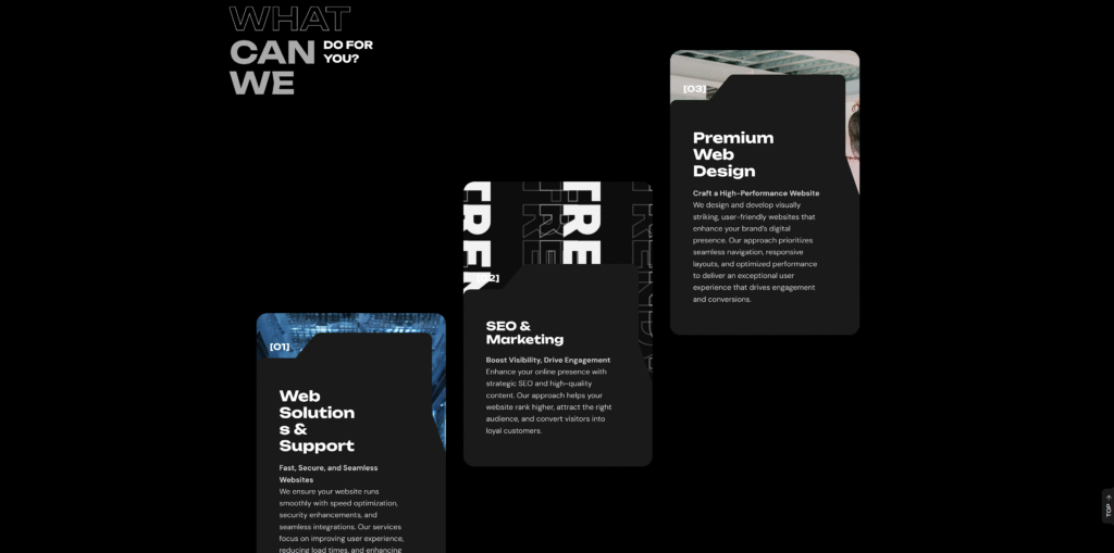
This section uses staggered card layouts with bold typography to differentiate between services. Each card contains a service title, a concise tagline, and a descriptive paragraph that communicates the benefits of the offering—whether it’s premium web design, SEO and marketing, or reliable support services. The visual layering and depth create an engaging aesthetic that feels both modern and dynamic.
WHAT CAN WE DO FOR YOU?
From a responsive standpoint, the layout adjusts by stacking the cards vertically on smaller screens, preserving the content flow and interaction quality. The use of consistent card shapes and unified design language ensures that visual harmony is maintained regardless of device. This section effectively demonstrates your ability to design interfaces that balance creativity with usability.
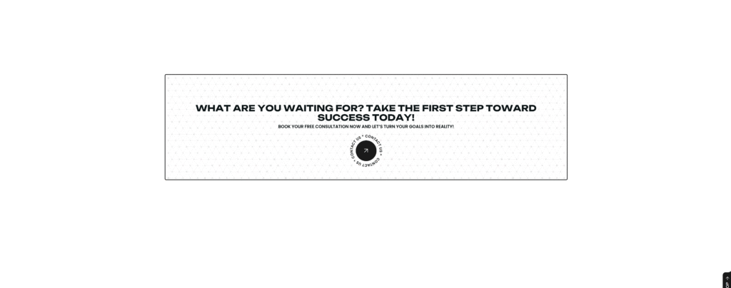
CALL-TO-ACTION
Motivating Action and Engagement
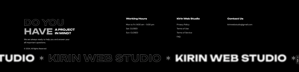
The footer is designed to function as both a resource hub and a brand reinforcement tool. It is divided into clear sections: an invitation to collaborate ("Do you have a project in mind?"), detailed working hours, quick access to essential legal links (Privacy Policy, Terms of Use, Terms of Service, FAQ), and straightforward contact information. This organizational structure ensures users can quickly find critical details without excessive scrolling or searching. The left-aligned motivational message complements the contact CTA above, reinforcing openness and readiness to assist new clients.
Additionally, the footer features repeated branding with a stylish logo strip at the bottom, creating a sense of continuity and professionalism. The use of contrasting fonts, minimalistic colors, and clean negative space provides a modern look while keeping the user experience seamless across devices. By wrapping up the site with easy navigation and strong branding, the footer leaves visitors with a final, positive impression of reliability, expertise, and trustworthiness — all key elements that support client conversion and brand loyalty.
The Footer
The Footer
This top-level footer section keeps user engagement seamless by prominently displaying the two most essential contact methods — phone and email — in side-by-side containers. The design is minimal yet functional, ensuring accessibility across all devices. A clear, bold phone number encourages quick calls, while the adjacent email container offers a more flexible point of communication. This layout caters to both spontaneous inquiries and detailed service requests, meeting clients wherever they are in their journey.
Stylistically, the section uses generous padding and a clean typeface to reinforce the sense of calm and professionalism that aligns with the brand’s identity. By separating phone and email into distinct containers, users are never left hunting for contact info, enhancing user experience while reinforcing trust and approachability.
The second section of the footer blends inspiration with information. The first container features a thoughtful quote: “Relax. Renew. Revive...” — setting a serene, wellness-focused tone that leaves a lasting impression. It reinforces the idea that massage is a vital component of self-care, not just a treat, and encourages visitors to prioritize their mental and physical well-being.
The following three containers deliver concise, well-organized navigation. The second container lists essentials like Privacy Policy, Terms of Use, and FAQs, ensuring the site meets usability and compliance standards. The third container continues with quick links to key internal pages — About Us, Services, and Contact Us — boosting usability and SEO. The final container houses the logo, subtly anchoring brand identity at the end of the user journey. This mix of motivation and utility wraps up the site experience with clarity, trust, and visual harmony.
RESPONSIVENESS
Responsive Design Strategy
Kirin Web Studio’s website is crafted with a refined, user-first approach to responsiveness, ensuring an exceptional experience across all devices. On desktop and widescreens, the design strategically maximizes space through expansive layouts, balanced grids, and sophisticated typography. Key sections — including the hero banner, service highlights, and calls-to-action — flow naturally with generous padding and well-paced content, allowing visitors to engage effortlessly. Subtle motion effects and high-quality visuals enrich the experience without ever overshadowing functionality, creating a sleek, modern environment that reflects the brand’s creative expertise.
As devices scale down, the design intelligently adapts without losing its elegance. On tablet screens (up to 1024px), elements gracefully reflow into a streamlined vertical structure, ensuring every interaction remains intuitive and touch-friendly. For mobile devices (up to 767px), a mobile-first strategy is fully realized — navigation simplifies into a hamburger menu, layouts become single-column for easy scrolling, and buttons are enlarged for effortless tapping. Throughout every breakpoint, the brand identity, readability, and functionality are preserved, guaranteeing that every visitor experiences the same high standard of quality, whether on a large desktop monitor or a small mobile screen.